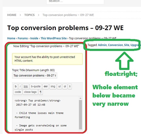
[2017-12-10 SU] I noticed that sometimes when I move an element to the right with float: right; elements below gets very narrow. The wider the moved right element, the narrower becomes element (usually DIV) below it.
Here, I want to write down a solution so that I do not have to search for it again.
Fist suggestion: (compromise and give up float right) instead on float: right; use display: inline-block;
That works like this: element below is no longer squished, and if screen is wide-enough your floating right element stays on the same line as previous element. But it is no longer aligned right. If this is not acceptable, please read on.
Second discovery: (CSS solution for most screen widths) keep float: right; , but apply new attribute to a next visible <DIV> element: clear: right;
 |
 |
|
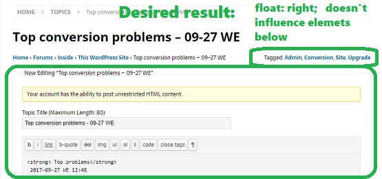
| You applied { float: right; } to a DIV (circled in GREEN), but now DIV below it, all of a sudden gets squished | { float: right; } works fine if there is enough screen width for both BREADCRUMBS (left) and TAGS (right – circled in green) | |
This appears to work. You keep your floating right and element below doesn’t get squished:
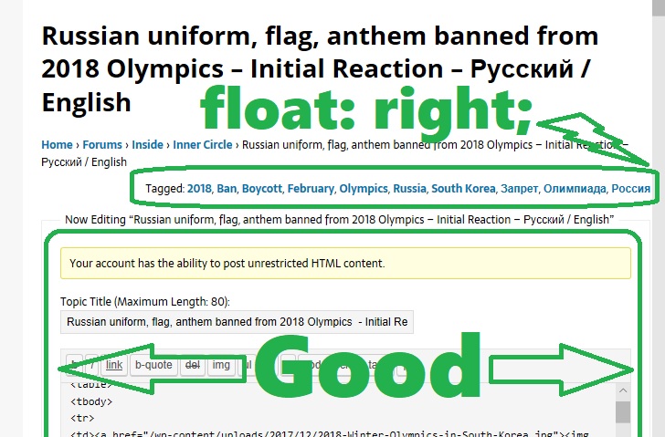
So the answer is: apply CSS { clear: right; } to a next visible <DIV>. However, if this solution works only 90% of the times, but you discover that at some browser widths squishing still occurs, please read on.
[2017-12-11 MO 17:04]
Third approach: (if you have access to code and can add a blank element after the right floater) simply add a blank <SPAN> with this style attributes:
<span style="clear: right; display: table;"></span>
This will take care of all browser widths, but only if you can insert an empty SPAN.
Forth solution and the winner – pure CSS solution. Apply this industry-agreed-upon CSS to your right floater element:
.whateverYouFloaterClass::after {
content: "";
clear: both;
display: table;
}
This solution frees your hands:
–01– you do not need to worry about next element,
–02- you do not have to change any HTML code.
With this approach, you simply apply more CSS to your floating element, and there are no more compromises. Let me explain what it does:
– first, you referring to your element by a class name “whateverYouFloaterClass”;
– next, you define a next HTML element with key word ::after with blank content (content: “”;)
– and finally, you use already familiar clear and display attributes to clear previous float settings.
This method work well if you do have to worry about additional floats after the element that you are trying to fix.

Be the first to comment